The New Evolution in Trading for Serious Traders, at any level.
It took 20,000 hours / 10 years to go through over 1,000 indicators to sort out the good from the bad, to create the perfect trading template.
So simple to use, that now even a beginner can make it in trading.
Read our story and watch the video.
Ready?

How trading used to make us nuts! Nothing clear. We felt blind.
So far, you have been dealing with uncertainty, hesitation, confusion, emotions, noisy charts, free worthless indicators that lag or repaint and the need to acquire endless skills.
You know the drill!
As traders, we hesitate before opening a position and still hesitate after.
• We open, the price comes back.
• We close, the price keeps going.
• Too early, too late.
• Is the trend turning or only pulling back?
• Fear of loss and fear of missing out.
• While in negative, we never know if we should cut our losses. We hope that the price will come back, but it doesn't. And what happens when we close? The price, of course, then comes back and explodes, so we miss it.
• When in positive, we continuously ask ourselves if we should let our profits run or close the position to secure them.
Nothing is ever clearly defined.
We've all tried a ton of strategies, watched countless videos, read hundreds of articles, publications, posts and tweets about patterns, price action and everything under the sun.
Even after years of study, we still often feel like we are gambling.
It took 20,000 hours / 10 years to test over 1,000 indicators.
And we failed 1,000 times.
For years, each and every day, from dawn to dusk, we focussed on one single thing: adding multiple indicators unto our charts to forward test them. Bar by bar, slowly scrolling from past to future, we looked at the accuracy of entries and exits provided by each indicator.
Before disqualifying any major or popular indicator, we also performed highly accurate backtests in MT4 by using decades of M1 tick data to reach 99% modelling quality.
And to verify the validity of any indicator, reading the code is mandatory (we had to see what was actually going on behind each), so we mastered 3 programming languages: mq4, pine script and java.
Plus, we applied many indicators on tick charts, Renko bars, Range bars, Kagi, Line Break and Point & Figure charts.
In summary, we did everything humanly possible ... and failed! Nothing worked.
We gave up, but we considered that sorting out every indicator had to have brought us closer to our end goal. This first step gave us the knowledge we needed to prepare the next phase.
A Breakthrough Was Imminent...
All that said, we completely changed our approach. We cleared all the indicators from our charts and concentrated on price action, naked charts. It took several years of study to master the language of the market, and it was worth it! At some point, we knew precisely what to build and we started coding what we knew would become the ultimate trading template.
Today, we are presenting a masterpiece.
After more than a decade of our lives, breathing in perfect harmony with the natural pulse of the market, it feels so natural, dynamic and "alive", as if this view was always meant to be.
Highlighting every crucial moment of the market, designed to indicate with great precision where to open and close, there's no lag, no repaint. It turns right on time. All the noise is filtered by color for a smooth ride, all the complexity and the confusion is gone. Direction, trends, pullbacks, accelerations, strong and weak moments, ranges, flats and equilibrium, are only examples of what the template lays out. It's everything a trader ever dreamed of and more!
Works on all TradingView charts
All markets. All symbols. All time frames.

How does it work?
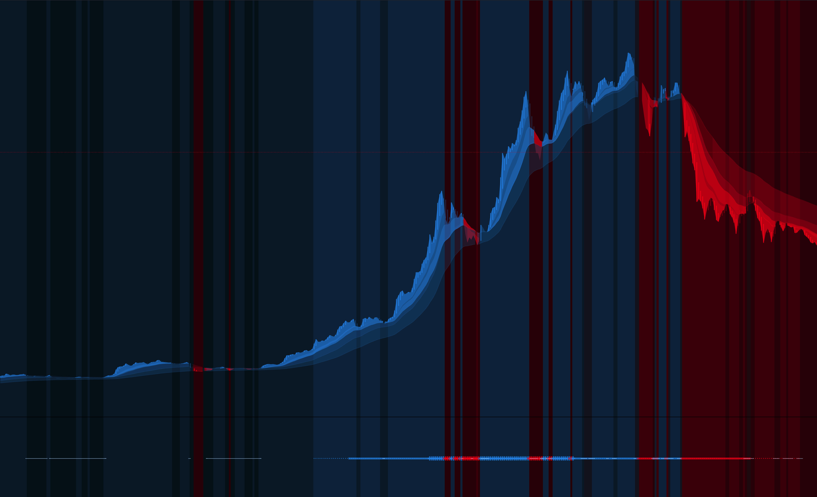
The Main 'Template' Indicator
•Blue Curve + Blue Background = Uptrend
•Red Curve + Red Background = Downtrend
•Otherwise = Pullbacks
The 'Phase' Indicator Colors the Candles
•Light Blue = Uptrend
•Red = Downtrend
•Other colors = No trend (Pullbacks, Consolidation, ...)
The 'Probability' Indicator Is Composed Of 75 Indicators (screen bottom)
•Higher goes the blue = Greater the probability of an uptrend
•Lower goes the red = Greater the probability of a downtrend
•White = Weak or Flat
•Vivid = Strength


